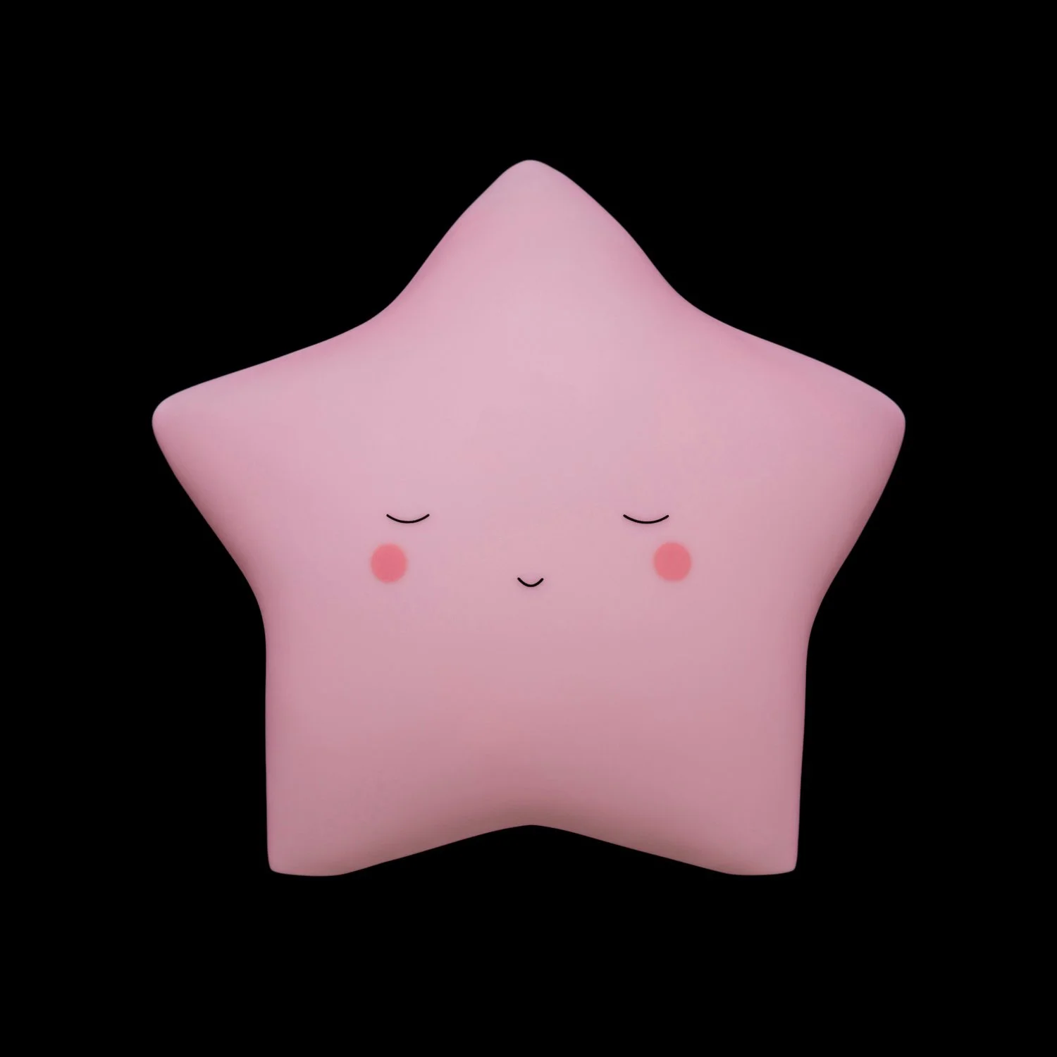





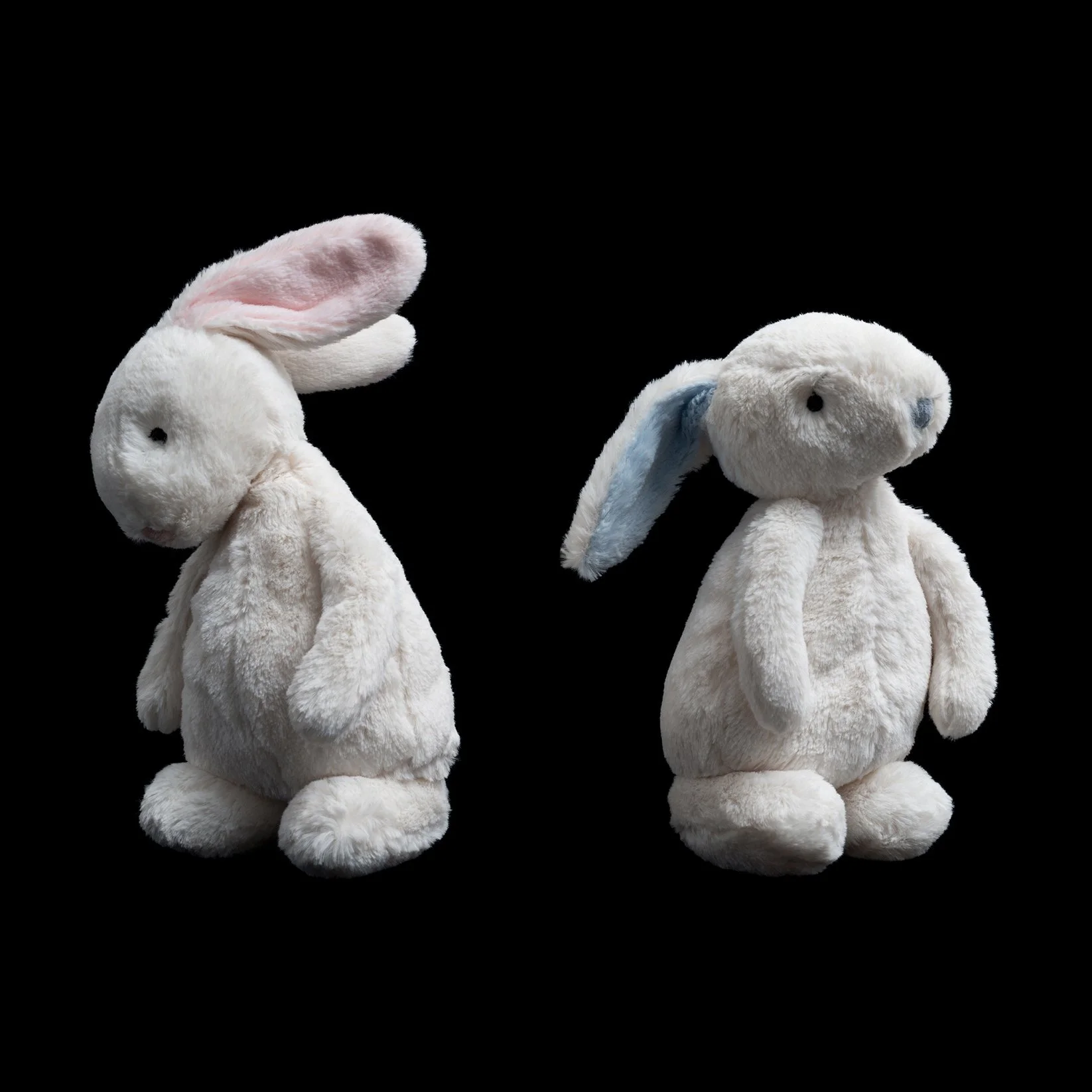
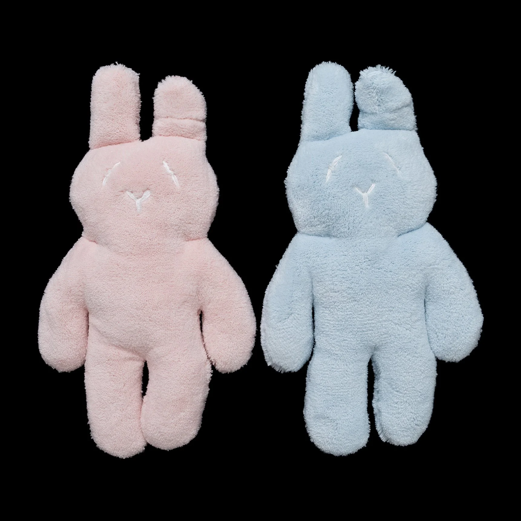
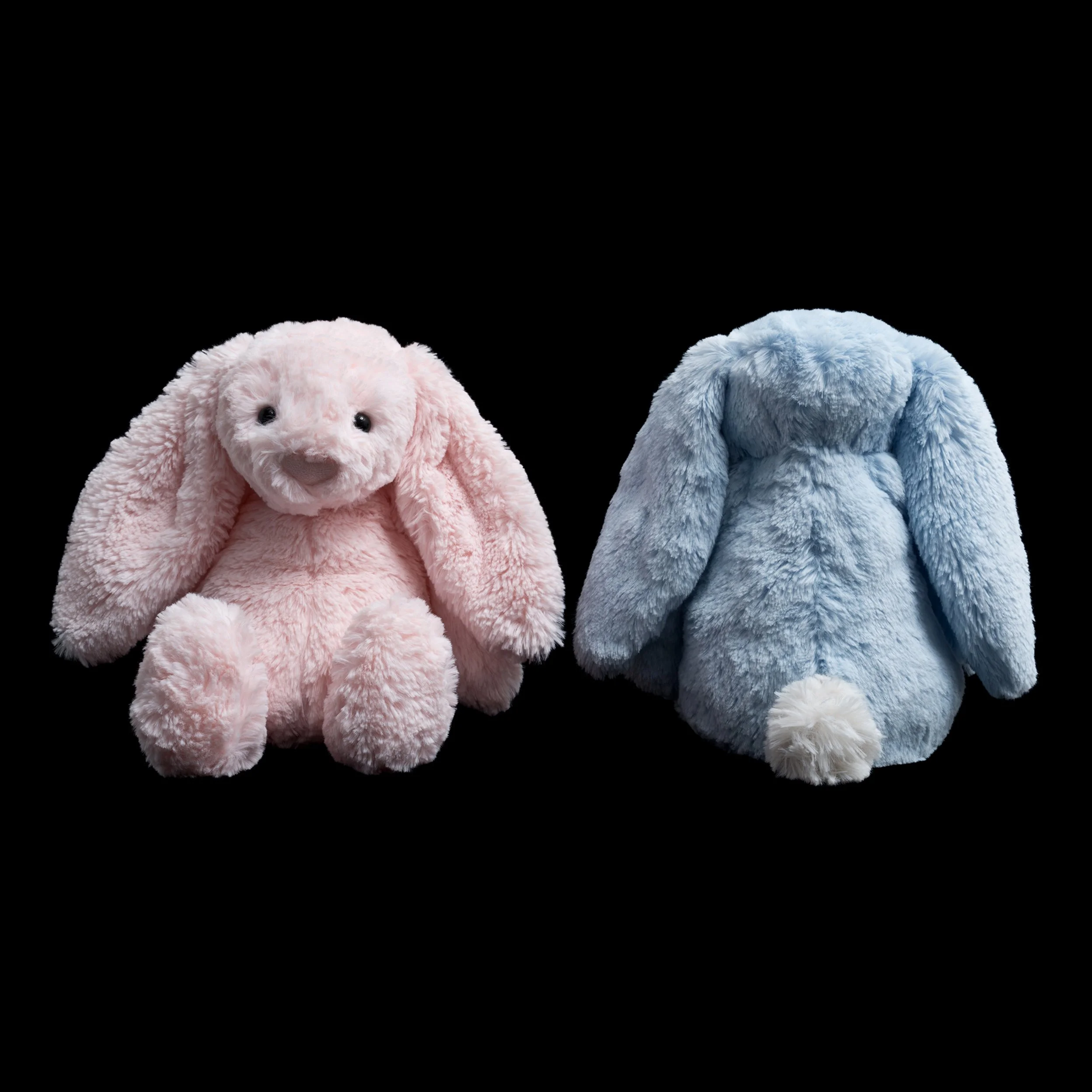
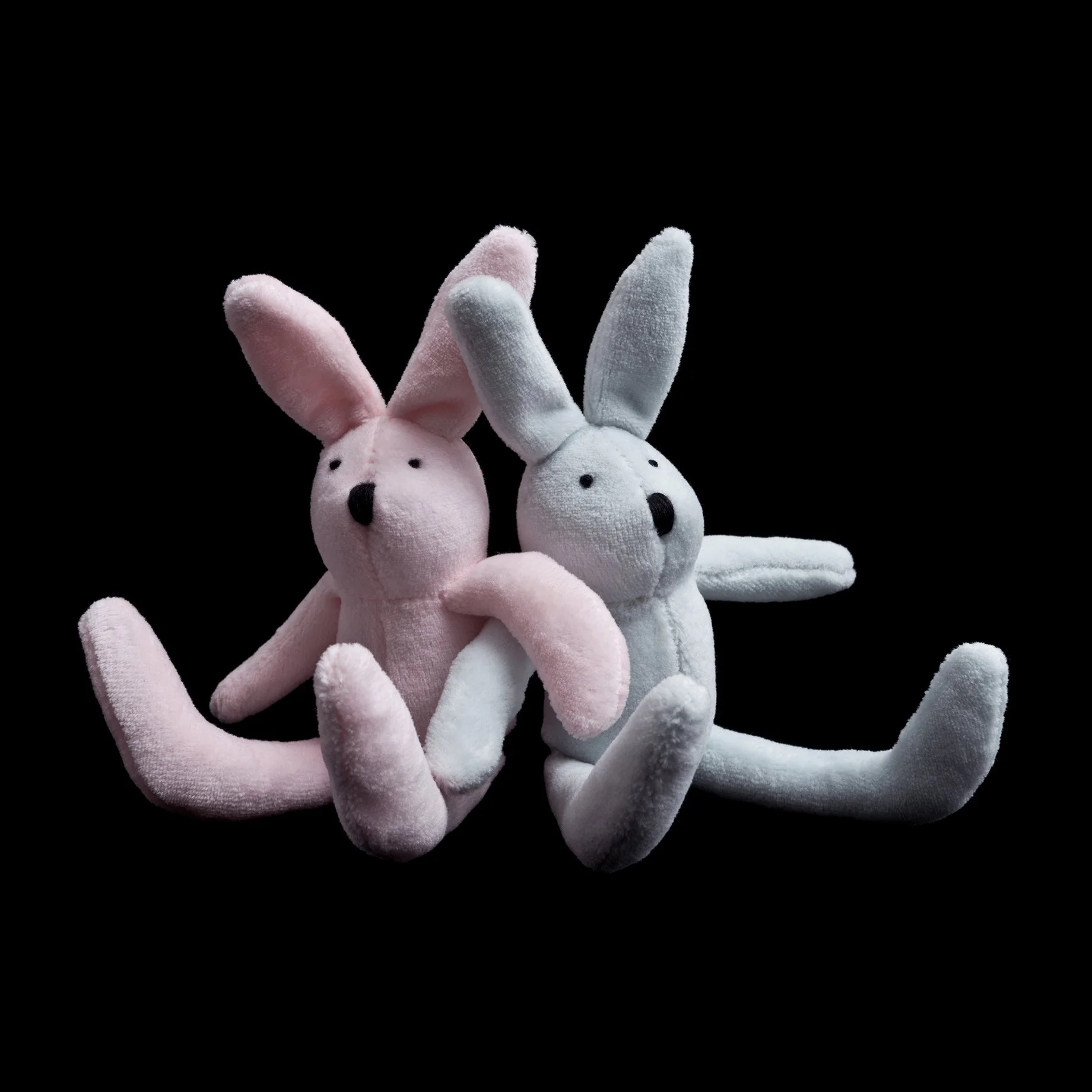
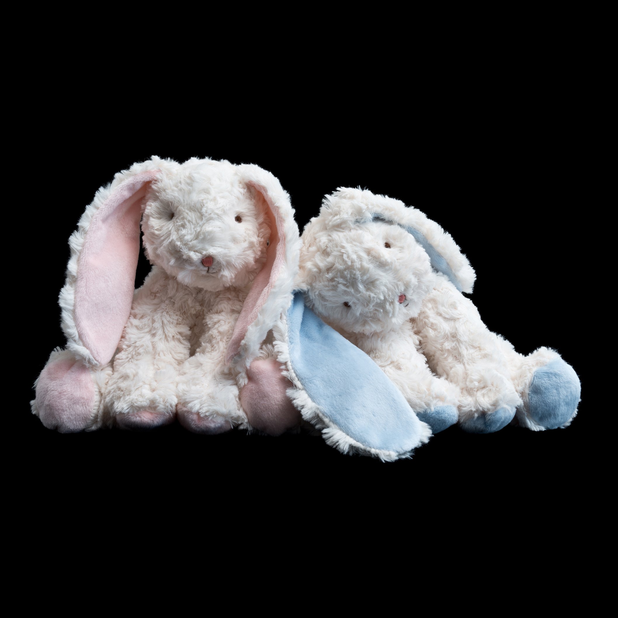
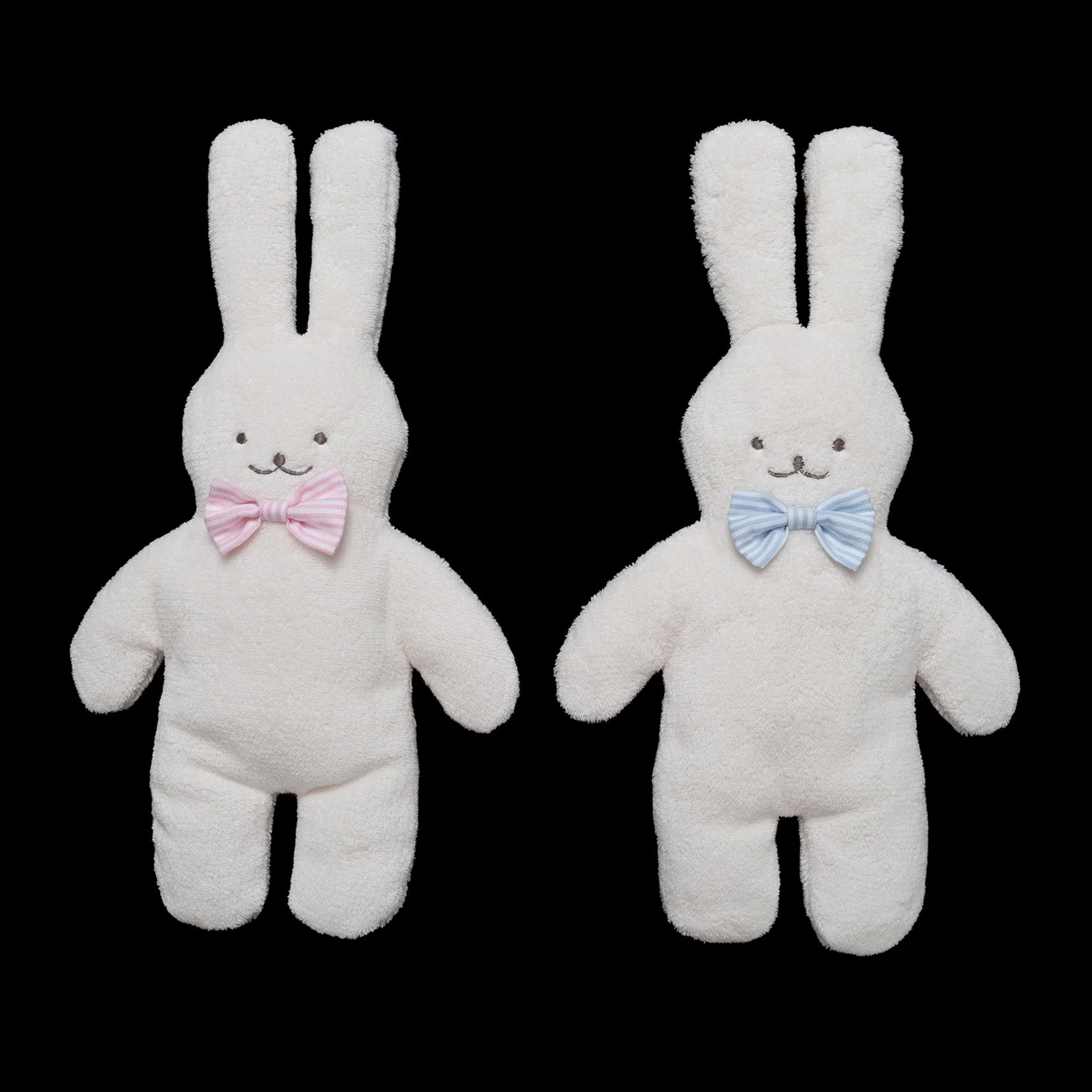
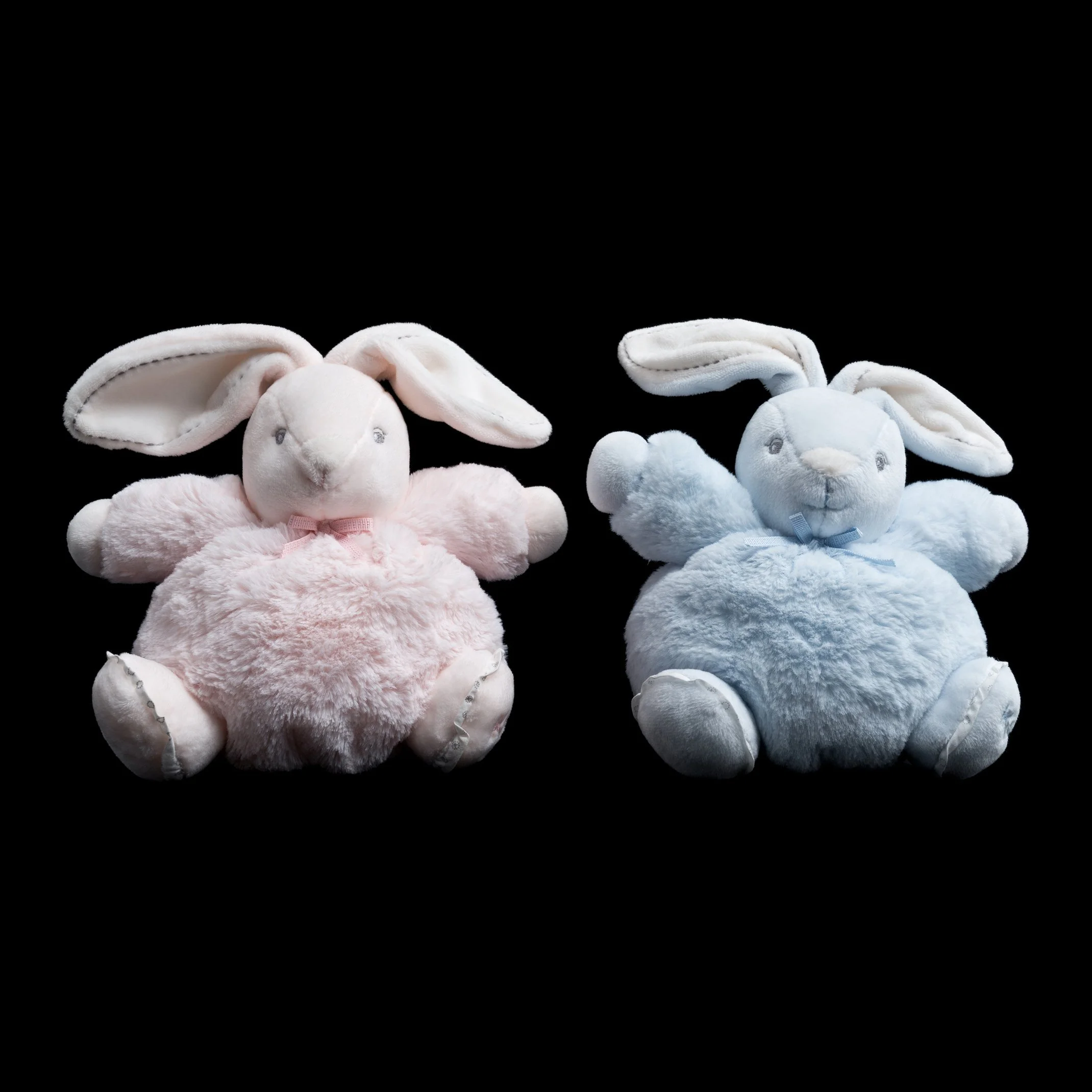
The artefacts of material culture are symbolic of our time. Gender-specific colours for baby products reflect a conservative pink-blue view of femininity and masculinity, while also encouraging consumption. In the nursery and the toy store, gender colour coding may seem cute and innocent. Still, its central effect is to establish gender binary stereotypes and draw clearly defined parameters for girls and boys. By dividing children into pink and blue, it limits possibilities, undermines freedom of individual expression, and creates conflict for those who do not easily conform to these simplistic and arbitrary codes. While collecting and photographing toys for Pink & Blue, I started to think about how to express the disturbing and negative aspects of gender coding through my photographs. This led to the idea of creating an installation reminiscent of a nursery at night, where darkness creates a sense of isolation and vulnerability, and even the cutest and cuddliest toys seem sad and lonely.
Anne MacDonald
Pink & Blue presents a series of seemingly innocent and innocuous photographic portraits of stuffed rabbits. Although they may initially appear to be nothing but cute, sweet little toys, each of these objects has been carefully selected by the artist for their symbolic references to infancy and the way in which gender is constructed and encoded during early childhood.
Printed on a scale that renders them larger than life, each pair of stuffed toys, one blue and one pink have been captured by MacDonald in what has become her signature style of almost hyperrealist photography. The soft plush texture of the stuffed rabbits can almost be felt. Each and every detail is pristinely captured. The casual way in which some of the toys slouch against or turn away from each other lends these lifeless toys just the faintest air of life-like animation…
The artworks themselves evoke the stylised professional studio portraits taken of newborn babies, whilst simultaneously eluding to the uniformly stark visual language of the commercial ‘product shot’, a universal vernacular now familiar to all consumers via our daily immersion in the world of advertising, store catalogues and online shopping.
In researching and creating this series, MacDonald was influenced by the writing of Jo B. Paoletti – an American scholar who has written extensively on the way in which consumer culture shapes identity - particularly gender. Expanding upon the questions raised and explored by Paoletti, MacDonald’s photographs prompt viewers to consider the phenomenon and effects of labelling and categorisation on the way in which we understand, construct and define gender. In a polarised world of pink and blue, there is little room for gender fluidity or individuality.
Rhianna Walcott